Wednesday, March 7, 2012

Post #9


           This quarter has been a very eye opening experience for me in the terms of art history.  There have been so many incredible eras during the class that it is hard to settle for just one.  However, I’d have to say that one of the most fascinating periods for me was the Baroque timeframe.  I have many reasons for this choice and every time I look back on these certain pieces, it unravels my mind on how much complexity and time went into each of the paintings in particular.
            One of the features from these paintings that have captured my attention is how they were able to illustrate such advanced techniques regarding lighting effects.  The element of creating such a dark and eerie piece was one of the things that drew me closer to these paintings, I can’t imagine how these artists were able to capture such moments that most of us can only capture with a camera today.  Another thing I really commend about these artists, as while they were still somewhat religious pieces, there were thrown into awkward and obscure positions that differentiate them from any other time period.  Through the idea, they executed figures emerging from the darkness, (also known as tenebrism) which helped illustrate each figures importance and derived where the focal point should be elaborated.
            During the Baroque period, it is easy to determine who one of the most important artists of this timeframe was.  Obviously Caravaggio.  In my opinion, he revolutionized the style into what it became during the seventeenth century.  One of his pieces that have really stood out to me was The Conversion of St. Paul (as seen on page 724 of Stokstad).  This piece represents almost every element of the Baroque period, to the tenebrism, to the triangular focus of the horse standing above the figure on the ground with his hands spread apart.  It also surprises me how Caravaggio made the horse as the largest figure in the painting; however, the focal attention is drawn towards the Saint Paul lying on the floor after being bucked off the horse.
            This is just one example of how the Baroque period was such an invoking idea through the seventeenth century.  The dramatic and over exaggerated scenes were definitely a new element through artwork that captured the attention of many individual viewers during this period and certain pieces of this style have carried on through generations of artwork.    

Wednesday, February 29, 2012

Post #8


    Moonlight Landscape by Joseph Wright of Derby is one of the most enchanting pieces that I have stumbled across through my outside research.  After scrolling through a handful of his work, I was immediately drawn to this particular piece.  One thing that draws my attention to this artist is his unique use of candle-lit portraits and vast use of shades through these various dark centered pieces.  As it has been described through other historians, Wright was driven by the idea of creating lighting effects throughout his art and continued to follow through with his unique creative eye for making these images come to life.
                  One thing that made Wright a unique artist at the time was the fact that he was one of the only artists to base his work outside of London (where he originally was born and raised), due to his decision to relocate to Italy.  As he developed as an artist, he quickly became fascinated with the idea of using various lighting techniques in his works, making him an artist that quickly stood out amongst the crowd.  His other famous pieces of work also incorporate his idea of candle-lit or naturally light paintings, but nothing quite grabs you like the Moonlight Landscape.  It was mentioned in one of the sources I found, that his paintings had a more advanced element that incorporated more emotion into his paintings, which many found to be mysterious and dark.  Through this technique, he flourished, making his work very popular and demanding, as he had such patrons as Lord Melbourne, Lord Palmerston, and Catherine the Great of Russia.
                  In the Moonlight Landscape painting, the subject matter contains a man walking his donkey across a bridge, while you can notice another man fishing below.  Both of these figures seem rather insignificant in the grand scheme of things, as the painting has so much information that it is trying to convey.  Parts of this painting that make it so remarkable are the amount of hue/shade changes between the center point where the moon is radiating outwards, it just shows how carefully planned and close attention to detail was put into this specific piece.  An example of this detail would be to just simply take a look at the river below, notice how the reflection of the moonlight just shimmers off the water’s surface?  It almost strikes me as a painting too good to be true, almost as if it should be a photograph; this is truly an overall achievement towards the human race for being able to create such an accurate painting from only oils onto a canvas.
                  There is no doubt in my mind that Joseph Wright of Derby could have possibly been one of the most articulate romanticism artists of the eighteenth century.  His rich understanding of science helps illustrate how his knowledge truly captivated his expressive moods throughout his paintings, making them seemingly realistic, almost as if you could breathe in the air and experience the environment.  This research has helped me search for an appreciation in a piece of art that I was able to explore on my own, and this is honestly one of the most remarkable pieces of all time.

Sources:
 

Wednesday, February 22, 2012

Post #7


            I believe that the Baroque period was a very interesting and evolving time for modern day artists, which allowed for expansion with more dynamic ideas.  When looking at Gianlorenzo Bernini’s David versus the Renaissance made famous statue of Michelangelo’s David, it is evident on how the style has changed from the old ideal beliefs.  Just simple details that can easily be noticed are what separate the Renaissance from the Baroque timeframe.
            For example, Bernini’s David has the facial structure of a well-developed fighter and older man, while the other express the face of that of a younger boy.  One of the main attributes of considering something as a member of the humanist and naturalist way was the idea of creating artworks, as they would appear in the natural world.  They mainly consisted of figures that are in relaxed positions with elongated limbs and seem calmer, which is exactly what Michelangelo portrayed with his statue of David.  This is easily distinguishable by examining the neck of the statue and the laid back stature at which he stands.  With having stated this difference, it is evident that Bernini’s piece stood for a more heroic figure that is expressed through his vicious, ready to attack pose.  The Baroque version of David is also covered with blood within his presentation, which symbolizes a little bit more of a darker and violent era, where on the other hand, David from the Renaissance is clean, and well presented.  I think the Renaissance period was more focused on highlighting one figure and expressing it in the most clean manner possible, while the Baroque period was more about creating an overall large masterpiece with much more content.  And as noticed, there are a lot of distracting pieces in the Baroque version of the David statue, which would not be commonly seen in the earlier Renaissance period, especially in the stance.
            While both pieces have many differences, there are some similarities that are obvious to the viewer.  Both artists really understood the idea of human anatomy for the most part and illustrated how the muscles, tendons, and skin was portrayed, especially for a figure who stood as a hero.  Another trait they both share is that they are both shown as nude figures, where Bernini’s sculpture has David dropping his armor as he is about the lunge forth a rock towards Goliath.  Overall, I can’t say that Baroque styles completely abolish or accept the ideas of the Renaissance one hundred percent, but they incorporate some certain aspects that has further advanced their works of art.

Wednesday, February 8, 2012

Post #6


            I feel like the Protestant Reformation had both a negative and positive side effects on Northern European arts.  It allowed artists to venture into new realms of creativity, but also hindered certain artists to create pieces of work that were in their comfort zone concerning religious pieces.  Aside from artists having to search for new lines of work, it opened a path for violent destruction of valuable pieces of European religion.  As the book explains, iconoclasm was the act of smashing religious images during this time, and was very popular for those involved in the constant rebellion for the Protestant cause.
            However, this new opening wasn’t entirely bad for expanding the horizon of certain artists and opened new doors for these painters to express secular ideas throughout their work.  Some of these new ideas included patron works, which highlighted and emphasized self-portraits of themselves and their spouses.  Another aspect of creativity that arose during the sixteenth century consequently was the idea of landscapes and surreal ideas incorporated into real life paintings.  Some artists used this as the perfect excuse to get into expressing their own ideas without being persecuted from religious patrons.  On the other hand, this had the negative effect on some artists who were only content with working on religious pieces for churches or other religious members of society.
            I believe a perfect example of artists illustrating new ideas is Albrecht Altdorfer’s Danube Landscape (page 688 in the text); it has the perfect combination of new elements that help express the artist’s individual creativity.  This was one of the first times that an artist developed a painting based specifically on a landscape that included no religious figures, not to mention had no figures involved at all.  Like mentioned in the book, this idea of creating landscapes became wildly popular in the later sixteenth century as it allowed artists to create new coloring and sceneries.  Although artists still focused on sacred places within these paintings, it still suggested that artists had the ability to venture out into new techniques and ideas for creating their own desired masterpieces.
            While most pieces during the Catholic artistic period involved stories or biblical passages, it has now swayed to incorporating parts that don’t exactly fit the narrative, but somehow relate to the overall theme of the painting.  They weren’t exactly concerned with actual proportions as well, rather just the pure aesthetic image that is composed as a whole.  Patrons once suggested Catholic based religious paintings are now shifting their ideas and beliefs, resulting in requests for self-portraits instead.  Like mentioned before, secular ideas were more valued during this period as it laid a cloud of confusion over religious leaders all across Europe.

Wednesday, February 1, 2012

Post #5

Pontormo - Entombment
Parmigianino - Madonna with the Long Neck

            Comparing Pontormo’s Entombment (from page 661) alongside with Parmigianino’s Madonna with the Long Neck (from page 662) are two pieces that have vastly different compositional elements that separate both in a wide spectrum.  Personally, I find it hard to believe that these pieces were only five years apart within their creation.  They both follow certain aspects of Mannerism that illustrates how these artists were evolving from the Early Renaissance style, but still paid attention to the criteria of naturalism.
            Some things that stand out as similarities are that both of the paintings seem to be conveying the same message as they highlight the importance as Christ within their arms or hold.  They both represent various uses of colors and shades within their pieces that help bring out detail and the importance of the attire they wore during this period.  Looking closer at the paintings, they both seem to portray women with slightly longer elongated necks, although it is more obvious in Parmigianino’s work.  They both focus on the Mannerism style by cropping others out of the painting, leaving more figures to the imagination as if they existed in real life outside of the piece.  With this being said, it leaves the idea that this exact image acts as if it completely natural and we shouldn’t be phased by the absence of the entire covered area.
            However, these paintings being so close to each other in date, also had a handful of differences that almost distinguish them as separate styles all together.  First off, within the Entombment, it seems to be a very busy painting with a lot of different clashing colors, which scatters the focal point, but eventually brings your eyes to the figure of Christ laying on a woman’s shoulders and another is carrying his upper body within her arms.  This varies greatly from Madonna with the Long Neck since this piece focuses exclusively on the importance of Mary and the son of Christ laying on her lap, which is also illustrated as a child and not a full grown man.  As far as color/hues go, I think that the Entombment piece uses a very wide variety of colors, but doesn’t use enough closely related colors that help really highlight detail within each figure like that of Parmigianino’s piece, which is overall a darker medium, but expresses vast detail throughout the entire painting.  In Madonna with the Long Neck, the artist focuses more on facial detail as well as capturing the basic elements of how his audience should grasp it.
            Although both of these paintings fit into the category of Mannerist style paintings, they seem to lack certain key parts that help create the “naturalistic” feel to them; such as the absence of the chair with Madonna, and the figures floating in the air in Entombment.  It leaves an unsatisfied feel to the painting, while still portraying the celebration and fascination of Christ.  If I were able to separate these two paintings into different categories, I would definitely say that Entombment falls into the category of Early Mannerist, while Madonna with the Long Neck would be deemed into the High Mannerist style.

Wednesday, January 25, 2012

Post #4 - High Italian Renaissance Art


            In this comparative analysis, I’ll be comparing Birth of Venus by Sandro Botticelli for my representation of the Early Renaissance era.  Against this piece, I’ll also talk about the famous Mona Lisa by Leonardo da Vinci for the High Renaissance period.  Both of these paintings have similar aspects that help the transition from each time period to the next.  One reason I have chosen to use these two pieces against each other is because while they both symbolize an individual woman, they vary widely in elements that build the classical antiquity that brings these paintings to life.
            Like I mentioned, they’re both representing a woman that is viewed highly in society.  Both of the females are brighter in contrast to their foreground to help draw focus to their faces.  While in today’s standards, these women would appeal as not as beautiful, but for the timeframe, these women were considered to be some of the most gorgeous women of the time, an ideal that others that would make comparable.
            On the contrary, these are vastly wide differences between these two that have shaped the eras.  Looking at the Birth of Venus piece, we notice that Venus is not alone in the scenery, while being accompanied by other figures.  However, the location and placement of Venus in this painting is key on bringing the focal point towards the middle, where she is standing covering herself.  While she remains nude in the painting, it draws attention to the fact that she is representing beauty and sexuality.  The coloring in this piece is very cool, but also has a lot of brighter and medium shades of greens and blues, which leaves a more exaggerated feeling the viewer.  Venus seems to look more content with the events that are taking place, while her face doesn’t appear to give off any indication of darkness.  I think that this piece has dynamic unity at the same time, lacks it.  This is because we still pay close attention to Venus for reasons explained, but yet at the same time, she is not entirely alone throughout the painting.
            What makes this different from the Early Renaissance painting is the fact that like described during the reading; she is represented through dynamic unity.  Which means that she is the only thing being represented in this painting.  This is different than Early Renaissance because it focuses directly on the woman in this portrait.  Which also leads to very different focuses when composing the piece, since it relies on detail within the facial qualities.  On the other hand, with the Birth of Venus, it relies on the entire composition that pulls everything together, which leaves some slack in having to detail each face to the same extent.  Mona Lisa is also very modestly dressed, without revealing her entire body, leaving a more moderate response to this article.  While the  colors within this painting are also very neutral, and mostly darker hues.  This has been considered to be a rather dark painting that makes it unable to identify the feeling that Mona Lisa was trying to portray through her portrait.  It leaves a mysterious feeling to it’s audience that has made this a very controversial painting over the centuries.

Wednesday, January 18, 2012

Post #3 - Formal Analysis


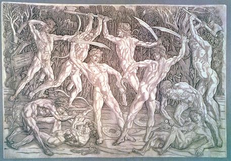
     In this formal analysis, I’d like to talk about The Battle of the Nudes, an engraving by Antonio del Pollaiuolo.  Although some may find this piece rather odd and unsettling, I can’t help but be simply fascinated by the amount of detail and realism that has been incorporated into this engraving.  My initial thoughts of when I study this piece of art is overwhelming, it leaves so much to the imagination, almost as if the artist wanted his audience to build their own conclusions on it.  I feel like this could be attributed to the lack of color within it.

        Something that has really drawn my attention to this piece is the level of sophistication and extreme detail that del Pollaiuolo expresses.  There are a wide use of lines, which vary in size, depth, and width.  Each has its own purpose to highlight certain parts of the male figure or the foliage displayed in the background.  It can be clearly displayed how each figure of the fighting males is moving in a certain way to extend and contract each muscle group.  In the book, it talks about how this piece of a perfect example of classical sculpture and anatomical research, and I couldn’t agree more.  During the fifteenth century, artists were still developing and experimenting with new ways to paint, engrave, and even sculpture, but this level of anatomical experimentation takes it to an entirely new level.  One solid piece to support this would be to look at the figures in the piece that have a weapon drawn or are in the act of swinging their weapon of choice.  Now take a look at the figure in the bottom right that appears to be injured from the battle.  We can clearly see that the muscles are not as defined as the figures that are still caught in the heat of the battle.  I find this as a fascinating part of the artist’s background, since there are people today that are still having a hard time grasping the concept of human anatomy within artwork, and this was created centuries ago.  In my opinion, del Pollaiuolo was ahead of his time with highlighting pieces of human anatomy.

 
     Though this piece looks quite amazing in a picture within a book, I can only imagine what it would look like in a person.  With this being said, another thing that really stands out is the absence of color.  While this may appear to be a more tasteless piece to some, it really draws my attention and leaves me in a moment of thought.  Like I mentioned before, it really leaves a lot of emphasis on the viewer, who is left to draw their own conclusions based on the colorless battle scene.  It helps highlight the muscle definition as we can see the lighter engraves help bring out the abdominal and oblique muscles. 

            Since this piece has no sort of added color to it, it expresses different levels of aspect through the shading of the engraving.  As we can see, the foliage in the background appears to be a lot darker than the male figures fighting.  We can also depict that the figures that are standing are carved much lighter than the figures that are closer to the ground.  Since there is no use of other colors, I feel Antonio del Pollaiuolo has used other resources to highlight where our focal point should be drawn to, which has added a deeper level of aspect and depth.

 
     Another key component that has been added is the false illusion of movement.  If we were to take a few seconds to study over this engraving, it would appear as if the naked male figures in this piece are actually in motion has they are lunging their weapons at each other.  It is also noticed that all the figures in this piece appear to be the same person, or have equally as noticeable qualities.  Whether this is a symbolic meaning or if the artist simply made all the male figures appear the same, it is still highly impressive to illustrate each character so closely through different muscle tensions.  Overall, I found this as a fascinating piece and a rather refreshing change from all the commonly publicized paintings that most people think of when it comes to Renaissance Italy in the fifteenth century.

Wednesday, January 11, 2012

Post #2 - Northern Renaissance Documentary


            During the rebirth of Northern Renaissance, artists took a different approach to their masterpieces.  Paintings and sculptures were the most popular forms during this era, and it countered what was presented in earlier times prior to this.  Although these pieces were attributed and influenced by the church, they contained more than just figures, they presented a story that could be aesthetically portrayed.  Famous artists such as the Jan Van Eyck from the documentary, not only created marvelous pieces that would flourish, but he invented a new way to approach the techniques of painting.  One of the most remarkable things that Van Eyck did in the film was creating images that not only reflected the light in the suggested areas, but he complimented it with the lighting that would directly affect the painting in reality.  This was something that nobody had ever been exposed to before.
            As the paintings and sculptures were widely popular, they had reason to stand out as much as they did back then to even today.  Within the documentary, they explained how each sculpture was almost embellished with its own personality, its own detail that separated each sculpture so much more from its accompanying pieces.  This gave character to each sculpture as it emphasized space and realism through each particular little detail.
            It appears that the influence of these works have changed drastically from prior forms, as they now focused on things that were now demanded by churches and patrons, which transformed the aspect of painting from a hobby to a highly respected career.  While religious forms of art were still desired, they found new ways to depict how they could make these images or stories come to life.  Another high value that was influenced in this time was patrons having artists painting portraits of themselves or regarding their family, which became overly popular in the 15th century.
            However, when paintings became the newest standard of artwork, Van Eyck’s career really took off.  It was the first time that painters were now heavily commissioned for their work from their patrons, and it opened new doors for artistic creativity.  As mentioned, there were many influences that directed how paintings were to be crafted.  Religious pieces such as the early alter-pieces have always played a large role in Renaissance art, but it gave artists the opportunity to express more than just one image, instead a collection of images that elaborated a story.  They also focused on creating images that were of everyday events that played an important role in Renaissance culture and sometimes even reflected art of an accomplished victory during a battle.  But soon after this stage, many painters transformed their skills into portrait paintings, usually suggested by the patron of the artist at the time.
            One thing that I believe really separated North Renaissance from the rest was the extreme attention to detail that the artists put into their masterpieces.  It was here that figures like Van Eyck really etched a name in what could be considered even in today’s standards as artwork that has more detail than a photograph.

Friday, January 6, 2012

Art 236 - Introduction Post

A little introductory about myself: my name is Kyle Gromala and I am continuing on with my Art History classes just as most of you are.  I'm currently seeking a degree in Fine Arts / Photography.  I'm currently a junior here at Central and am trying to decide if I will pursue grad school when the time comes or join the working world.

When I think of Renaissance Art, so many things come to mind.  As we know, it was a great breakthrough with artwork and experimentation, but it was also a turning point when people started thinking in a new and unusual way.  Artists went against what others thought as farfetched and continued to do it anyway, revolutionizing certain techniques that have been popularized even in today's society.  Although I am not very familiar with too much Renaissance art specifically, (which I know will change over the next few weeks) I do know that it was an era of creativity and exploration.  Such examples were the large named artists that everyone and their grandmothers know about such as Michelangelo, da Vinci, and Giotto.  These artists didn't become legends for no reason, they changed the face of the artistic world.  New aspects were constantly being introduced into this time frame, such as the integration of three-point perspectives, which continued to protrude through famous paintings and canvases amongst many emerging artists.  I am looking forward to this class quite a bit more than Medieval and Ancient History because of all the new aspects and ideas that were expressed during this era.  It was truly a time of brilliance and expressive creativity.

Wednesday, November 30, 2011

Post #9


During this quarter, I have taken a higher interest and appreciation for the ancient architecture that can be viewed as art.  Most importantly, such works as Stonehenge, the Parthenon, and the Temple of Aphaia.  I find these pieces of work to stand out above others through the ages because of the severe complexity that has been put into raising these marvelous structures.


The Parthenon, although a popular piece that we associate with ancient Greece art and culture, stands out to me as one of the most well thought out pieces of architecture from the centuries.  Not only does it serve its aesthetic purpose, it has been composed and designed by the idea of math; there is much more to the structure than just a few pillars and columns strategically placed, it has been mathematically calculated to each exact point.  It highlights areas of precision and pays close attention to proportions throughout the entire building.


Another piece which has been considered artwork and highly controversial over the centuries is Stonehenge.  One of the greatest attracting ideas to this architecture is the fact that nobody is quite sure of how it became to be, where it came from, or what it even symbolizes; its entire existence is just a giant question.  To think that some of the stones average around from 13 to 24 feet tall and weighed up to 26 tons each makes it hard to believe that people could construct this during the 2500 B.C. era without the help of machines or devices.  There are even such theories that such figures as Merlin, who was the magician of the King Arthur legend had built it and that Stonehenge was the primary location for Celtic druid rituals.  Something that leaves me thinking about the idea of the architecture of this is the fact that the bluestone was not located anywhere close to where the actual stones are placed.  The book refers that they would have been moved over 150 miles from the west in order to arrive to their current location, which makes us wonder how that is humanly possible without the technology we have today.


Along with these two pieces, I found the Temple of Aphaia to be rather intriguing as well.  The way that the temple was structured and designed showed that there was also a fair amount of time put into figuring out how the columns would hold the roof and combining structures.  The temple also uses mathematical proportions within their columns that expressed artistic creativity by the engravings towards the top.

I realize that some of these may be a little cliché in the terms of what artwork we should be choosing to focus on since we covered so much, but the architecture just stands out so much above the rest to me that it is hard to ignore.  Such intricate and mathematical measures have been presented in creating these columns in most of these temples that it is fascinating to think somebody could replicate these detailed designs over.

Wednesday, November 9, 2011

Bust of Commodus as Hercules vs. Caracalla

  In these sculptures, both contain various attributes that can be considered as power.  Both figures were sculpted to highlight their facial structure definition, to show that they were probably wealthy and powerful judged off their looks.  On the other hand, there are very contrasting points within these pieces.  For example, Caracalla has a V-shaped forehead above the eyebrows, which gives off more of a sinister, dark feel to his personality.  Perhaps he ruled the people by being notorious and ruthless, thus winning the hearts of his followers by fear.  In the Bust of Commodus as Hercules, the statue seems more relaxed and apathetic.  The figure in the sculpture seems like he presents more of a calm, monotone presence over people, making him a selected person that people would more look up to rather than fear.  At the same time, he has a fanged animal trophy over his head and draped around his neck, showing that he is fierce and a fighter.  Not to mention, the club he holds in his hand as well shows that he is a combatant.  Caracalla is a more simple piece and only draws my attention because of how much anger is carved into this sculpture.  It is almost scary how his face is positioned and even more creepy how his eyes are looking straight up.  It appears as if he is looking up towards the Gods in spite of something.  Caracalla would appeal more to the fighting type people as he highlights as a ruthless leader of anger and blood, which Commodus as Hercules appears more as a loving warrior that would rather capture the trust of individuals.

Wednesday, November 2, 2011

Greek Art - Option #2

     I personally think that the Parthenon Marbles should be relocated back to Athens.  I'm aware that this is a highly debated subject and a part of me knows that there is no right or wrong answer to solve this case.  If we were to look back into other events such as artifacts that were looted during Iraq's liberation, it was a bad decision to hold their arts/history in a museum in such a dangerous location.  However, it still belongs to their country and ancestors/people that belong to its history, whether or not it is in a safe place.  I do think that during the time, Britain was entitled to owning these marbles since Greece wasn't entitled to their freedom yet during the ruling of the Ottoman Empire.
   
     Also, I feel like the Parthenon Marbles was a very important part of Greek culture and has a highly popular image as the aesthetic architecture movement.  Being located in the British Museum entitles that it would also be safer due to the pollution eating away the marble issue that was also addressed in Athens.  At least in Britain, it will be properly preserved and displayed for centuries to come.  So the great question is, would it make more sense to keep it here in order to ensure its survival?  Probably.  But would it be disappointing if someone was set on seeing Greek art over in Greece?  Yes.  If Britain is to continue displaying this art, I think it should be presented in a more historical context since this type of work was made popular by the Greeks.  It is a piece of their history and establishes their roots.  Like I mentioned before, there is no right or wrong answer, and I've somehow caught myself in the middle of both sides.  But if I had to choose a particular case to follow, I'd have to say that Greece is entitled to own their own heritage.

Wednesday, October 19, 2011

Aegean Art - Option #2

    Based on the location of the Minoan civilization, I believe that the first piece of art belongs to these Bronze Age people.  One of the first pieces of evidence that leads me to believe this was that on page 84, where it claimed that, "with many safe harbors and a convenient location, Crete became a wealthy sea power, trading with mainland Greece, Egypt, the Near East, and Anatolia".  Another chunk of evidence lies on page 87, explaining that, "Minoan painters worked on a large scale, covering entire walls of rooms with geometric borders, views of nature, and scenes of human activity".  Having stated this and referring back to the image, it is clear that this figure is some sort of fisherman and/or fish trader.  Also, it is easily noticeable that at the top of the slate lies somewhat of a border that has outlined this image, although, it appears to me as if this image has been removed from a larger scale painting or canvas of figures.  According to the shades and colors used to develop this piece, it is evident that the "Spring Fresco" on page 91 in the textbook shows some common similarities with the colors used in this unidentified piece.


     For this next ceramic piece, I believe that this could have possibly been from the Mycenaean civilization.  One of the reasons I think this is, is based on the ceramic imagery presented on page 99 in the textbook.  If you notice the characters in the unidentified image and the image in the book, you can notice that both of the figures within the ceramics look very cartoon like.  It is clear that they did not design the figures to be accurate in proportion to reality, but more so to just create a simple symbol.  All of these civilizations were involved and responsible for ceramic works, however, the Mycenaeans were the only ones to incorporate different colored metals in their works.  While ceramics was also one of their large areas of focus, another piece that leads us to this assumption is the fact that their kraters (bowl for mixing water and wine) were all commonly produced with a certain scene that could tell a story and symbolize some sort of message.  One of the major reasons why I don't think it is Cycladic is because they were focused more on sculptures and those that involved nude women and emphasized symmetry.

Wednesday, October 12, 2011

Giza Pyramids vs. Ziggurats of Near East

     Ziggurats of the ancient Near East, like pyramids were used for the purpose of religious meetings between gods and humans.  Pyramids were similar in some ways, but were mainly used as funeral locations for wealthy rulers that had them constructed for themselves.

     Pyramids had various elements involved within their tombs specifically, such as sculptures located throughout, as well as paintings that could possibly relate to their afterlife future or even some that could tell a story about the patron.  Ziggurats were supported by the wealthy, built over other ruins upon ruins to hold ceremonies regarding the connection between the heavens and the people.  Like pyramids of Giza, these ziggurats were built with a handful of stairs in order to reach the top of the shrine.  Both of these structures were used to symbolize or represent some sort of ruler of person of higher status during their lives.

      Ziggurats were usually built over previous sacred sites and continued to be built on as they been known to serve the "Bond between Heaven and Earth".  They were also usually built upon larger cliff areas that looked over flat lands, which also helped them gain the name, "House of the Mountains".  While pyramids were built with much more time and preparation, they were carefully planned out and some took a decent amount of time to build since they had much more underground structures to build.  On that note, ziggurats were built more for aesthetic purpose on the outside of what is presented, rather than what is below or buried at the tomb.

     So overall, ziggurats and pyramids were both used as special ceremonial places to be used for worship and connections directly with the gods.  But the primary contrasting differences is, are that pyramids were used for burials more than meetings, ziggurats were used to hold meetings for religious purposes generally.  Both were large pieces of architecture which held some symbolic meaning during their time frame, both equally as important during each civilization.

Wednesday, October 5, 2011

Darius and Xerxes Receiving Tribute


                One of the more elegant pieces of Eastern art that has grabbed my attention was the relief of Darius and Xerxes Receiving Tribute.  This piece is not only sculpted into a few characters, but rather tells a story.  Also, this relief is believed to symbolize not Darius in the throne, but rather Xerxes, the up and coming successor of his father.  In this piece specifically, Darius is supposedly being greeted in a ritual manner that is referred to as a proskynesis, while Xerxes (son of Darius) overhears what is being presented.  This piece can be found on the Apadana staircase located in Persepolis, Iran.

My initial reaction to this piece was bland and dull.  It didn’t have much variation, nor did it contain much information based solely on the image.  However, after reading more about this relief, I discovered a few things that have helped mold my perspective into thinking otherwise.  First off, I learned that in Eastern art, people were not very fond of having their actual face portrayed in self-portraits, it was something that most people would simply prefer not to have.  Thus, making it impossible to identify who is Darius and who is Xerxes, because they have the exact same face.  Facial features were not a high priority in these forms of work.

                 This relief is actually portrayed within the Apadana, within Persepolis, Iran (which was the audience and meeting area to greet Darius and attend events).  During this time frame, the Persian Empire reached from Africa all the way to India, thus making Darius a very powerful and renowned figure during the Ancient Near East era.  It was said that this piece of art was at a time more vibrant with colors and metals that were used to emphasize Darius’ crown and gold leaf used for his necklace.  Key components in this relief are used to show just how powerful and royal Darius was at this moment in his reign.  Noticing how his feet are not touching the ground, but have their own ataman to rest upon, reflects that he was of high power.  Another thing that drew my attention was the fact that he has two guards behind him and two more guards in front of him, both symmetrically placed to achieve the King’s protection.  He also has an entourage of potentially royal figures/family that stand beside and behind him on his throne, proving that he must be of a higher importance.

              Placed in front of Darius are two incents stands, implying that his throne was a clean place and had the type of resources that he could keep his palace pristine.  It is hard to tell what the people behind Darius are holding, but each one seems to be wielding a different object.  Although, the figure behind Darius (who is assumed to be Xerxes) is also carrying the same object as the King, possibly a goblet or a brazier of some sort.  The figure directly behind Xerxes appears to be a woman because of the ornament she is wearing on her head, covering parts of her face and seems to be holding some sort of cloth.  And furthermore, the figure behind her seems to be holding some sort of pickaxe, with a dagger drawn to his waist.  This was probably considered a man who was handy with creating things, maybe a carpenter under the King’s personal request.  What I found strange was that the guards to the far right seem to be found holding what looks like a purse, or a small knapsack.  But being that close to the incents, it could just be more material to keep the scent of the place.

             I find it simply fascinating that such a small detailed relief from a staircase in a audience hall can tell such a story.  Perhaps there is more to the story than historians can even make from this and from what information we have gathered over the years.  In my opinion, there is always more information to uncover, especially from such early Persian times like these.  Although this relief was made during the last five years of Darius' ruling, it could simply be a story to illustrate how Darius is now passing the throne on to his successor and son, Xerxes.  To be able to make such intricate reliefs at this early of a time frame blows my mind and has helped shape the world into what the Greek's adopted as art.  And from there, what the rest of the world soon adopted as art.